ExamDiff Pro 11.0: Dark Theme and Flattened UI |
Along with a new look for diff reports, ExamDiff Pro 11.0 gives the application itself a makeover, introducing a more modern flattened UI style and a new dark mode theme option.
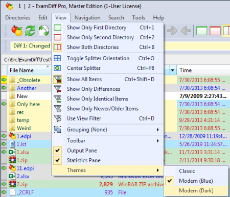
If you're a fan of dark UIs, the new dark theme is just a click away. To switch to it, go to View | Themes and select "Modern (Dark)":
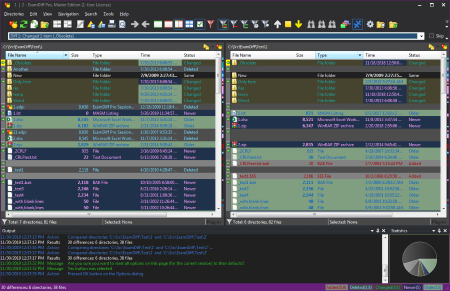
and we are in dark mode!
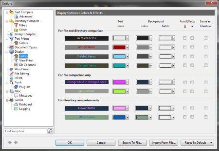
Note that switching to the "Modern (Dark)" theme changes not only the colors of the application UI, but also the colors used in comparison - this is because colors selected for a light UI likely wouldn't make sense in a dark UI. You can modify comparison colors for dark mode by opening the Display | Colors options panel while in dark mode:
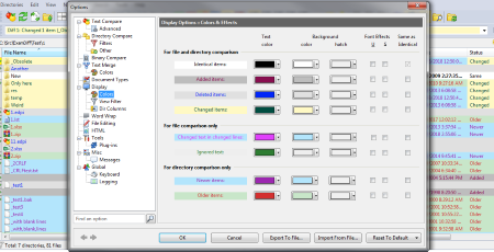
ExamDiff Pro now keeps track of color options separately between light and dark modes, so switching back to light mode (that is, selecting any theme other than "Modern (Dark)" under View | Themes) will bring back your previously-chosen light mode colors:
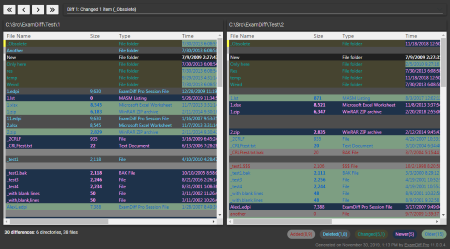
Also note that when you're in dark mode. HTML diff reports that you create will also use the dark theme:
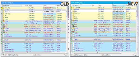
Regardless of the selected theme, ExamDiff Pro 11.0 has a more flat look compared to previous versions, blending in better visually with other modern Windows software. Here's how a comparison pane looks now in the modern flat UI compared to the older beveled UI:
Labels: 11.0, ExamDiff Pro, Features


0 Comments:
<< Home