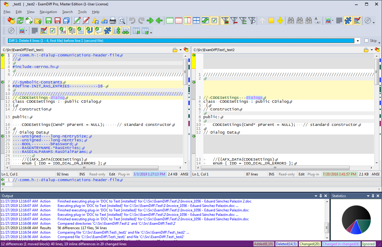
ExamDiff Pro 11.0 introduces a new Statistics panel, allowing you to immediately see diff stats at a glance.
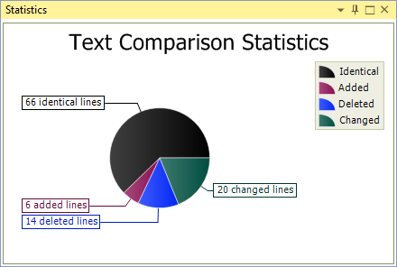
By default, the Statistics panel appears at the bottom of the application, to the right of the Output panel. In file comparison mode, it displays a pie chart of identical, added, deleted, and changed lines, each segment colored according to the text color specified for that category (customizable in Options under
Display | Colors):
You can double-click anywhere in the panel to pop it out into a separate window, magnifying the pie chart and labeling its segments:
Double-clicking on it again docks it back where it was.
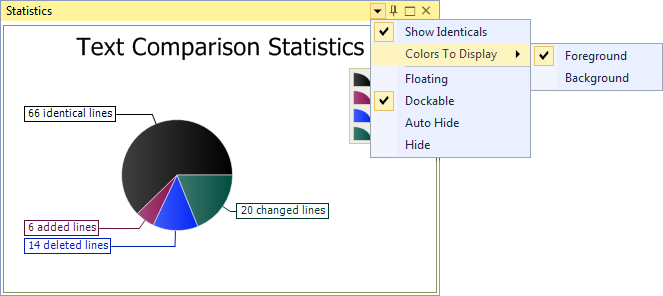
You can customize the Statistics panel's position and the chart's appearance in the context menu, accessible by clicking on the down arrow at the top right of the panel:
The
Colors to Display option allows you to choose whether to use each category's text/foreground color or background color. This is useful if, for example, you're using light-colored text on a dark background (particularly relevant in the new
dark UI theme) and find the different text colors hard to distinguish from one another in the chart.
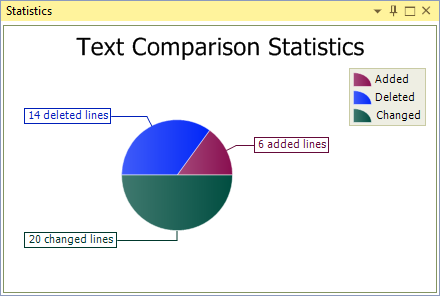
By default, identical items are displayed as a category in the chart. Uncheck
Show Identicals in the context menu to hide the Identical segment and get a closer look at the differences:
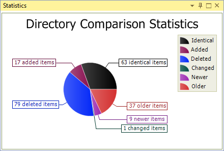
The Statistics panel appears in directory comparison as well, in which case the chart displays the number of files/directories that are identical, added, deleted, changed, newer, and older (the latter two categories appearing only if
Full File Comparison is disabled):
No comments:
Post a Comment